Tuesday, May 28, 2019

Week twelve UX

Image result for back of picture frame
This is a good example of GOOD user experience, this frame and like most frames are designed perfectly so that you can either hang them or have them leaning with a piece designed to help prevent it from falling.


Image result for bio oil
This is a good example of BAD user experience. Being that its an oil, I believe they should have designed the bottle in a way that would prevent the oil from pouring out so quickly.

Tuesday, May 21, 2019

Week eleven UX

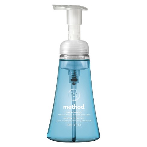
Image result for method hand soap foam
This is a good example of GOOD user experience. I think Method's invention of foam soap is so smart because it is less messy and the bottle is designed in a special way to turn the liquid into soap.
Image result for bad user experience examples
This is a great example of a tea kettle that has BAD user experience. The handle and spout were designed to be on the same side making it impossible to use the handle.

Tuesday, May 14, 2019

Week ten UX

Image result for snap ware
The is a great example of GOOD user experience. I love these snap ware. The way they were designed make it super easy for them to be locked tight so nothing can spill and easy to store in your fridge without taking up a lot of space.

Related image
There doors are a great example of BAD user experience. These doors can be very deceiving bc they say push but instead of having a bar to push they designed it confusing by hading handles that you normally pull.

Monday, May 6, 2019

Week nine UX

Image result for toothpaste crest tube
This is an example of BAD user experience. Most tooth paste tubes are designed poorly, making it hard to get every last bit out no matter how hard you squeeze it. I believe they should design something more efficient.

This a great example GOOD user experience. This is also a great solution to the above bad user experience. This product helps squeeze every last bit of toothpaste out of its tube so you can get all your moneys worth.