Tuesday, May 28, 2019

Week twelve UX

Image result for back of picture frame
This is a good example of GOOD user experience, this frame and like most frames are designed perfectly so that you can either hang them or have them leaning with a piece designed to help prevent it from falling.


Image result for bio oil
This is a good example of BAD user experience. Being that its an oil, I believe they should have designed the bottle in a way that would prevent the oil from pouring out so quickly.

Tuesday, May 21, 2019

Week eleven UX

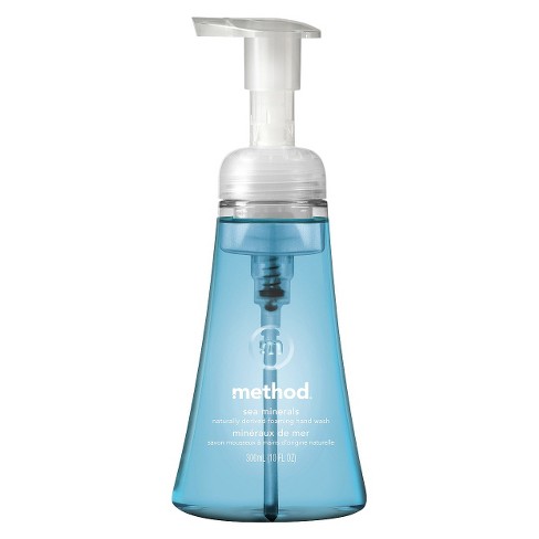
Image result for method hand soap foam
This is a good example of GOOD user experience. I think Method's invention of foam soap is so smart because it is less messy and the bottle is designed in a special way to turn the liquid into soap.
Image result for bad user experience examples
This is a great example of a tea kettle that has BAD user experience. The handle and spout were designed to be on the same side making it impossible to use the handle.

Tuesday, May 14, 2019

Week ten UX

Image result for snap ware
The is a great example of GOOD user experience. I love these snap ware. The way they were designed make it super easy for them to be locked tight so nothing can spill and easy to store in your fridge without taking up a lot of space.

Related image
There doors are a great example of BAD user experience. These doors can be very deceiving bc they say push but instead of having a bar to push they designed it confusing by hading handles that you normally pull.

Monday, May 6, 2019

Week nine UX

Image result for toothpaste crest tube
This is an example of BAD user experience. Most tooth paste tubes are designed poorly, making it hard to get every last bit out no matter how hard you squeeze it. I believe they should design something more efficient.

This a great example GOOD user experience. This is also a great solution to the above bad user experience. This product helps squeeze every last bit of toothpaste out of its tube so you can get all your moneys worth. 

Monday, April 29, 2019

Week eight UX

This speaker is an example of BAD user experience. It does not go loud enough and there is no setting designed to change the volume. I was not thrilled with this product when I bought it. 

This candle is an example of GOOD user experience becuase it can easily be put out with the cover made special to allow zero oxygen inside in order to put out the fire. Not only that, the lid is special for the fire and does not get black from the dust and smoke.  


Sunday, April 28, 2019

Week seven UX

This foundation bottle is a great example of GOOD user experience. This foundation bottle was designed to easily pump out the foundation and when the liquid is running low it can still pick up from the very bottom of the bottle, very convent for getting the most of your moneys worth. 

This NARS lip gloss is an example of BAD user experience. I have these in multiple colors and I noticed that they all leak everywhere. They were clearly not designed well. Many people have complained about this specific lip gloss and its tendency to leak. 


Monday, April 15, 2019

Week Six UX

I have this CONAIR blow dryer and I think this is an example of BAD user experience. I am not thrilled with the setting it offers. There is only a high, off and low setting. I think blow dryers or hot tools in general work better and accurate when there is a temperature option.  

This shampoo and conditioner bottle is a great example of GOOD user experience. I love how the bottles were designed so easy for storage and so easy to access with a simple pump. 

Tuesday, April 9, 2019

Week Five UX


This Xbox controller is an example of GOOD user design. Each button makes a different move while playing the video game. This controller is designed to be comfortable when holding it. The shape is designed so that your hand feels comfortable when playing the game and makes it easily accessible to each button while keeping your hands in a comfortable position.   

These salt and pepper shakers are one's I have purchased from the holy land of Israel. I am a bit disappointed with the way they were designed. In order to fill them with both salt and pepper you need to flip it and open the shaker in the middle to fill. This is an example of BAD user designer because when it is flipped over when you are trying to fill it the salt/pepper spills through the holes. 

Tuesday, April 2, 2019

Week Four UX

My crock-pot is something that has GOOD User Experience. It is easy to use and has four avalible settings. 


This is a small photo of my brother when he was younger. I was working on his yearbook pictures for him and I had to scan the images onto my computer first. I had very very BAD user experience. The photo would not upload to the site I was trying to upload it onto. I was very frustrated. 


Tuesday, March 26, 2019

Week Three Reich


Apple is a great example of GOOD user experience. I find this website to be super easy to navigate. It is not overwhelming with texts and images. It is sleek, clean and organized. Apple is known for their simplicity. 
 Image result for instax mini 9 blue image 
My install mini camera is an example of BAD user experience. It does not tell you when you need to change batteries. The options for lighting is limited. I am not so happy with this product. 


Thursday, March 21, 2019

Week Two UX

Facebook is a great example of GOOD User Experience. On their website it shows recent log ins, making it easy to sign in the next time you come onto facebook. This is helpful because it saves you a step.

Bellevue Online program is a great example of BAD User Experience. They do not give you the ability to edit your work after it is posted. Nor do they notify you when someone or your professor comments on your work. This needs to be changed!